This tutorial shows how to create and populate charts through DocuMotor. It will focus on standard charts, which are all charts excluding extended charts (box and whisker, funnel, sunburst, treemap, region map, and waterfall). The data structures for the extended charts are explained after this tutorial in the section named Extended Charts Data.
The data needed for the charts are identical for both Word and PowerPoint. However, the bindings are different; these differences will be explained in more detail further down in the tutorial.
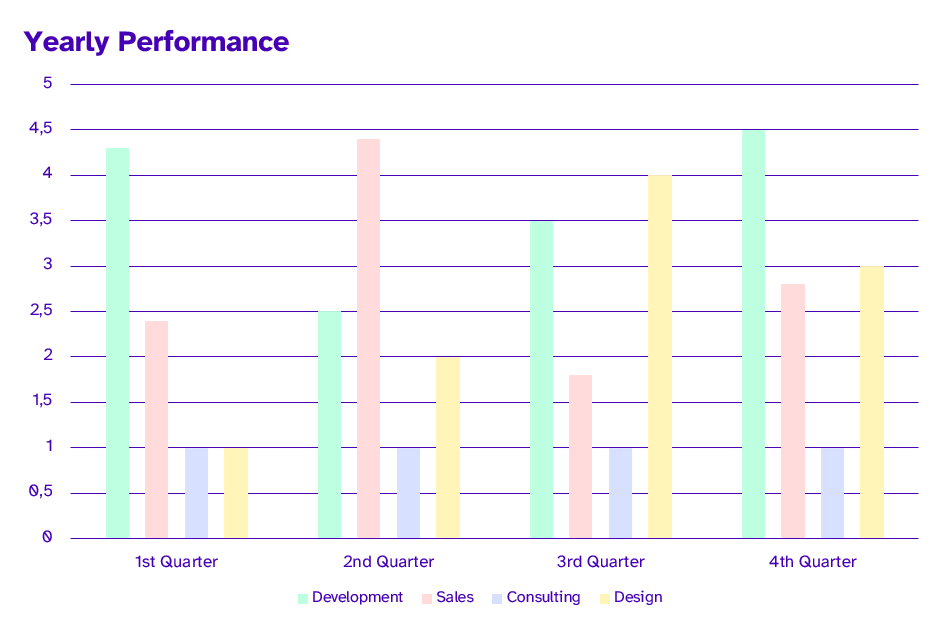
In the first part of this tutorial, we will create the chart below:
Data Structure
To populate charts from data in DocuMotor, your result data from your transformation has to have a specific data structure. This structure is the same for both Word and PowerPoint.
In this case, we work with the following sample data:
{
  "ChartData": [
    {
      "Category": "1st Quarter",
      "Series": "Development",
      "Value": 4.3
    },
    {
      "Category": "1st Quarter",
      "Series": "Sales",
      "Value": 2.4
    },
    {
      "Category": "1st Quarter",
      "Series": "Consulting",
      "Value": 1
    },
    {
      "Category": "1st Quarter",
      "Series": "Design",
      "Value": 1
    },
    {
      "Category": "2nd Quarter",
      "Series": "Development",
      "Value": 2.5
    },
    {
      "Category": "2nd Quarter",
      "Series": "Sales",
      "Value": 4.4
    },
    {
      "Category": "2nd Quarter",
      "Series": "Consulting",
      "Value": 1
    },
    {
      "Category": "2nd Quarter",
      "Series": "Design",
      "Value": 2
    },
    {
      "Category": "3rd Quarter",
      "Series": "Development",
      "Value": 3.5
    },
    {
      "Category": "3rd Quarter",
      "Series": "Sales",
      "Value": 1.8
    },
    {
      "Category": "3rd Quarter",
      "Series": "Consulting",
      "Value": 1
    },
    {
      "Category": "3rd Quarter",
      "Series": "Design",
      "Value": 4
    },
    {
      "Category": "4th Quarter",
      "Series": "Development",
      "Value": 4.5
    },
    {
      "Category": "4th Quarter",
      "Series": "Sales",
      "Value": 2.8
    },
    {
      "Category": "4th Quarter",
      "Series": "Consulting",
      "Value": 1
    },
    {
      "Category": "4th Quarter",
      "Series": "Design",
      "Value": 3
    }
  ]
}
All types of standard charts require the same data structure. Note that some chart types, like pie and doughnut, only have one series, and therefore the data should reflect that.
We use the following transformation to output the data in the needed structure. Note how each object is evaluated ([*]), categories are gathered, and duplicates are removed by using distinct. Next, the values are filtered by each series and grouped.
{
  multiSeriesChart: {
    title: 'Yearly Performance',
    categories: distinct(ChartData[*].Category),
    series: distinct_by(ChartData[*].{
      name: @.Series,
      values: parent(@).ChartData[?Series==$.name].Value
    }, name)
  }
}
The result data structure has to look like the following:
"multiSeriesChart": {
  "title": "Yearly Performance",
  "categories": [
    "1st Quarter",
    "2nd Quarter",
    "3rd Quarter",
    "4th Quarter"
  ],
  "series": [
    {
      "name": "Development",
      "values": [
        4.3,
        2.5,
        3.5,
        4.5
      ]
    },
    {
      "name": "Sales",
      "values": [
        2.4,
        4.4,
        1.8,
        2.8
      ]
    },
    {
      "name": "Consulting",
      "values": [
        1,
        1,
        1,
        1
      ]
    },
    {
      "name": "Design",
      "values": [
        1,
        2,
        4,
        3
      ]
    }
  ]
}
As the above shows, there are some keys in the data structure that has to have the exact names as above. Those are title, categories, series, name, values, and labels. The only key that can be named freely is the key that is called multiSeriesChart in above example. This key is required since it holds all the chart data.
Below is a table explaining what values the different keys require and which are required and which are optional:
| Name | Required/Optional | Type | Description |
|---|---|---|---|
| title | optional | string | The chart title. |
| categories | optional | string[] | The names of the categories of the chart. |
| series | required | object | Contains the keys: name, values, and labels. |
| name | optional | string | The name of the series. |
| values | required | number[] | The different values for the series. Note that it has to have the same length as the categories array. |
| labels | optional | string[] or number[] | The content of the datalabel. |
For PowerPoint it is also possible to define axis titles for the charts that have axes. If the axis title values have to be set in the resulting chart, the template chart should have the axis title elements added to the chart. The data structure parameters should be defined as follows:
| Name | Required/Optional | Type | Description |
|---|---|---|---|
| primaryCategoryAxisTitle | optional | string | Title of the primary category axis. |
| primaryValueAxisTitle | optional | string | Title of the primary value axis. |
If the data structure does not align with the data points you want to display in a chart, it is possible to fill out the missing points with the List_range_fill function.
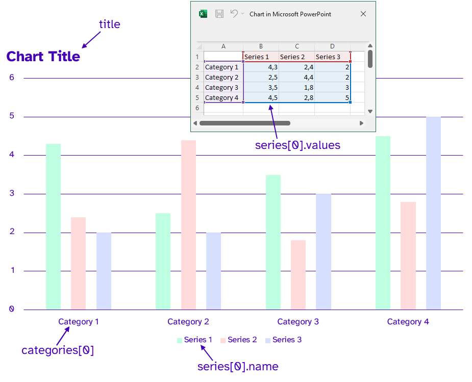
Template
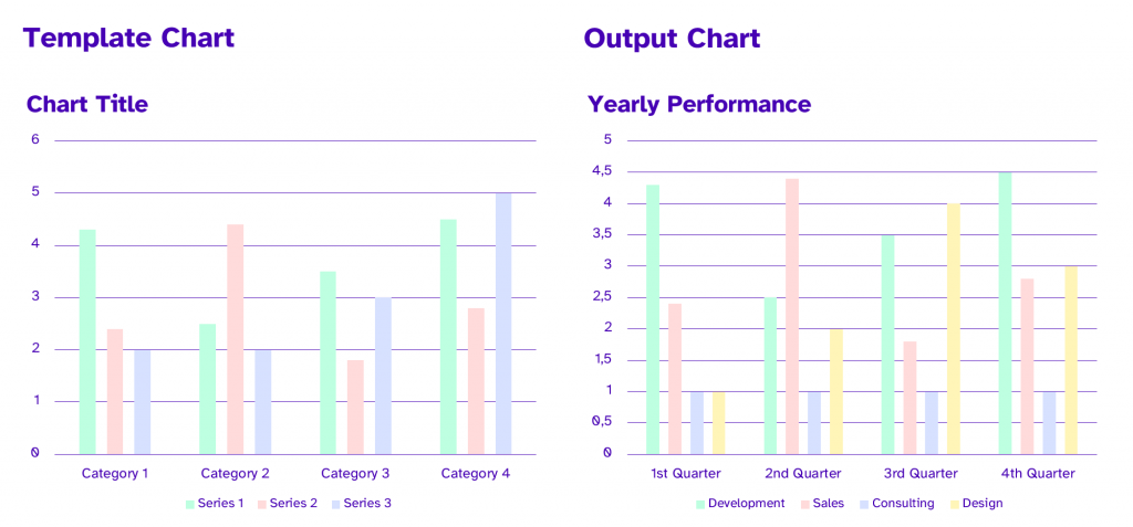
When a chart is needed in the final output document, the template has to contain the chart. This template chart can be a standard generated chart. The title, values, and naming of categories and series do not matter since the data from DocuMotor populates all of this if it exists in the result data. If some of the optional elements from the data structure are left out, for example, the title, then the output chart title will keep the same title from the template chart. Regarding the creation of the template chart, it is the same whether it is in Word or in PowerPoint. The only difference between the two applications is the bindings.
If special colors are wanted for the chart, these have to be created in the template chart. It can either be done by creating a chart with the maximum number of series and setting the wanted colors. The data from DocuMotor will then only show the number and series that there is data for. Another way of setting colors is to apply the wanted color theme to the template document/presentation.
If data labels are wanted for the chart, and the data contains the labels data the template needs to have data labels applied to the template chart.
Word
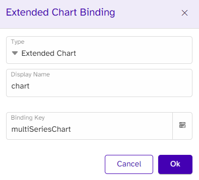
In Word, you use the DocuMotor interface to add a binding to a chart. The BindingType is always “Chart” whereas the BindingKey has to be the freely chosen key name from the result data in DocuMotor. This shows that the BindingKey is “multiSeriesChart” matching the name of the chart data in the data above. The type should be chart, and the binding key would be the key of the chart data. DocuMotor will, based on this input, place a Rich Text Content Control in the template where the chart is wanted, and a chart is inserted in this Content Control. Here the chart can be customized if needed when it comes to, for example, colors or font type. As mentioned earlier, the data can be completely dependent on the result data in DocuMotor, and therefore this can be disregarded.
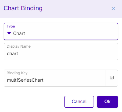
If you download the template and open the Content Control properties, the binding is now added to the Content Control’s tag.
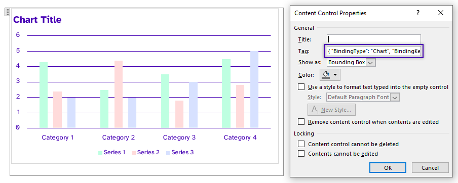
The binding in the Content Control tag should look like this:
{ "BindingType": "Chart", "BindingKey": "multiSeriesChart" }
PowerPoint
In PowerPoint, you also use the DocuMotor interface to add a binding to a chart, and fill out the same information. However, in PowerPoint, the binding is created in the Alternative Text (Alt Text) for the chart. A chart is inserted on the desired slide in the template. As in Word, the data of the template chart is not important in PowerPoint either since it will depend on the output data from the result data in DocuMotor. When downloading the template and right-clicking the chart, it is possible to see that the binding has been added in the Alt Text.
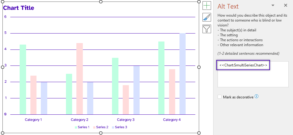
The binding in the Alt Text should look like this: <<BindingType:$bindingKey>>
The Result
When all the data is transformed, and all the bindings are in place, the following chart is generated:
Extended Charts Data
If you work with extended charts (box and whisker, funnel, sunburst, treemap, region map, and waterfall) the BindingType is ExtendedChart, and that is the only difference when you bind to a chart in your template.
However, the data structure in your transformation needs to be adjusted to the specific chart. The following section will give you an overview of the different data structures needed.
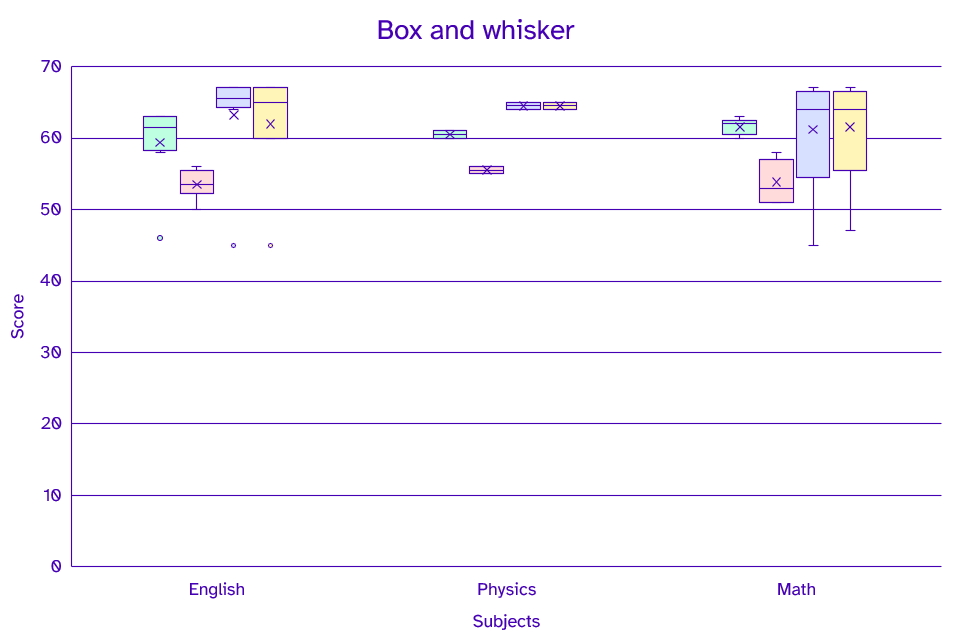
Box and Whisker
The data below shows an example of the data structure for a Box and Whisker chart. As seen in the data, there is the same amount of categories as there are values in the four different series, and the values match the categories on their respective indices. Below the data, there is also an example of the output chart.
"boxWhisker": {
    "title": "Box and whisker",
    "primaryCategoryAxisTitle": "Subjects",
    "primaryValueAxisTitle": "Score",
    "categories": [
      "English",
      "Physics",
      "English",
      "Math",
      "English",
      "English",
      "Math",
      "Math",
      "English",
      "English",
      "Physics",
      "English",
      "Math",
      "Math",
      "English"
    ],
    "series": [
      {
        "name": "School A",
        "values": [
          63,
          61,
          63,
          62,
          46,
          58,
          60,
          62,
          63,
          63,
          60,
          60,
          61,
          63,
          59
        ]
      },
      {
        "name": "School B",
        "values": [
          53,
          55,
          50,
          51,
          53,
          56,
          51,
          53,
          54,
          52,
          56,
          56,
          56,
          58,
          54
        ]
      },
      {
        "name": "School C",
        "values": [
          45,
          65,
          65,
          64,
          66,
          67,
          67,
          66,
          64,
          67,
          64,
          67,
          45,
          64,
          65
        ]
      },
      {
        "name": "School D",
        "values": [
          45,
          65,
          65,
          64,
          60,
          67,
          67,
          66,
          60,
          67,
          64,
          67,
          47,
          64,
          65
        ]
      }
    ]
  }
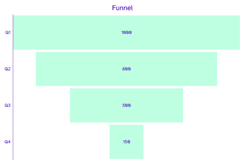
Funnel
The funnel chart uses the same data structure below as standard chart data for a single series chart.
"Funnel": {
    "title": "Funnel",
    "categories": [
      "Q1",
      "Q2",
      "Q3",
      "Q4"
    ],
    "series": [
      {
        "name": "First Series",
        "values": [
          1000,
          800,
          500,
          150
        ]
      }
    ]
 }
Sunburst
In the Sunburst chart, it is important to notice that there now is an extendedCategories collection that contains all the category objects that has a name and a categories collection like usual. Below the example data structure, you can see an example of the chart.
"Sunburst": {
    "title": "Sunburst",
    "extendedCategories": [
      {
        "name": "Layer 1",
        "categories": [
          "Branch 1",
          "Branch 1",
          "Branch 2",
          "Branch 2",
          "Branch 3",
          "Branch 3",
          "Branch 3",
          "Branch 3"
        ]
      },
      {
        "name": "Layer 2",
        "categories": [
          "Stem 1",
          "Stem 1",
          "Stem 2",
          "Stem 3",
          "Stem 4",
          "Stem 4",
          "leaf 7",
          "leaf 8"
        ]
      },
      {
        "name": "Layer 3",
        "categories": [
          "Leaf 1",
          "Leaf 2",
          "Leaf 3",
          "Leaf 4",
          "Leaf 5",
          "Leaf 6",
          "",
          ""
        ]
      },
      {
        "name": "Layer 4",
        "categories": [
          "End 1",
          "End 2",
          "",
          "",
          "End 5",
          "End 6",
          "",
          ""
        ]
      }
    ],
    "series": [
      {
        "name": "First Series",
        "values": [
          22,
          12,
          18,
          87,
          88,
          17,
          10,
          20
        ]
      }
    ]
  }
Treemap
The Treemap chart is identical to the Sunburst data structure above, but here we have an extendedCategories collection.
"Treemap": {
    "title": "Treemap",
    "extendedCategories": [
      {
        "name": "Layer 1",
        "categories": [
          "Branch 1",
          "Branch 1",
          "Branch 2",
          "Branch 2",
          "Branch 3",
          "Branch 3",
          "Branch 3",
          "Branch 3"
        ]
      },
      {
        "name": "Layer 2",
        "categories": [
          "Stem 1",
          "Stem 1",
          "Stem 2",
          "Stem 3",
          "Stem 4",
          "Stem 4",
          "leaf 7",
          "leaf 8"
        ]
      },
      {
        "name": "Layer 3",
        "categories": [
          "Leaf 1",
          "Leaf 2",
          "Leaf 3",
          "Leaf 4",
          "Leaf 5",
          "Leaf 6",
          "",
          ""
        ]
      },
      {
        "name": "Layer 4",
        "categories": [
          "bear 1",
          "bear 2",
          "bear 3",
          "bear 4",
          "bear 5",
          "bear 6",
          "",
          ""
        ]
      }
    ],
    "series": [
      {
        "name": "First Series",
        "values": [
          22,
          12,
          18,
          87,
          88,
          17,
          10,
          20
        ]
      }
    ]
  }
Region Map
In the Region Map chart, the data also has the extendedCategories, but it is important the categories are defined as something the chart would know. For example, the below categories have names of states in the USA. As long as the data depicts known areas, the template chart can be created as a default world map, which in this case, automatically will change to a map of the United States, as you can see in the example result chart below.
"RegionMap": {
    "title": "Region Map",
    "extendedCategories": [
      {
        "name": "State",
        "categories": [
          "Washington",
          "New York",
          "New Mexico",
          "Texas",
          "California",
          "Nevada",
          "Florida"
        ]
      }
    ],
    "series": [
      {
        "values": [
          50,
          5,
          35,
          20,
          19,
          28,
          45
        ]
      }
    ]
  }
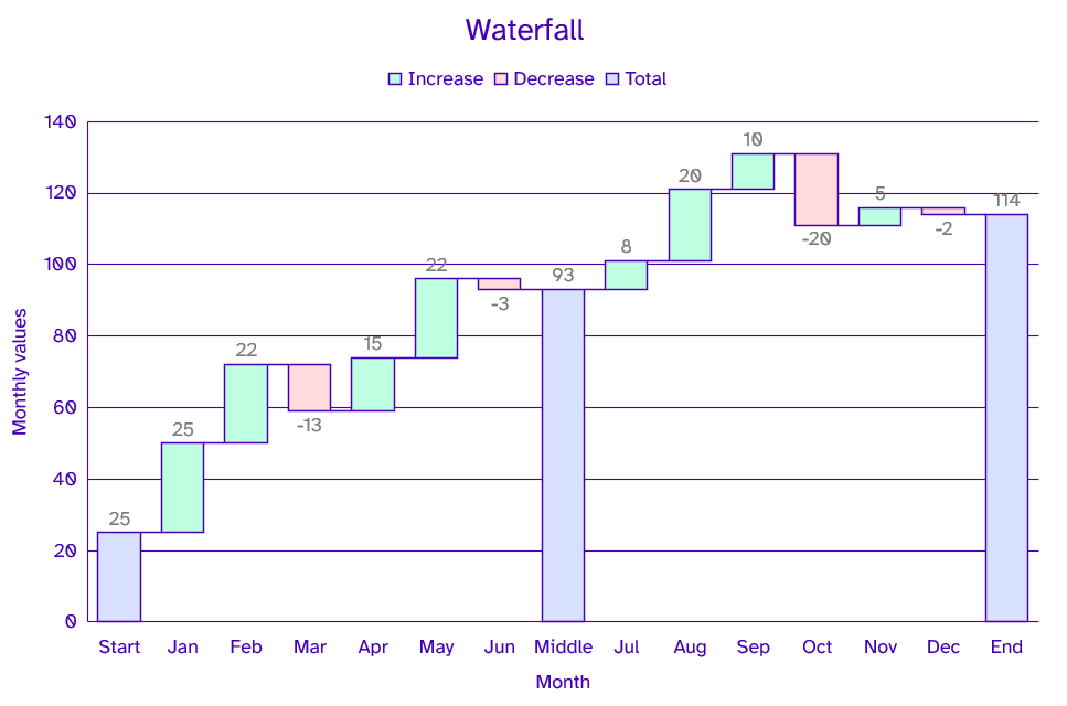
Waterfall
Below is an example of the data structure for a waterfall chart. Here we have an element called subtotals. The numbers defined here are the indices of where the chart should add a subtotal of the values. These indices match the index of the categories and values. So if the subtotal on index seven matches the category on index seven called “Middle” and value index “93,” which is also shown in the example output chart.
"Waterfall": {
    "title": "Waterfall",
    "primaryCategoryAxisTitle": "Month",
    "primaryValueAxisTitle": "Monthly values",
    "categories": [
      "Start",
      "Jan",
      "Feb",
      "Mar",
      "Apr",
      "May",
      "Jun",
      "Middle",
      "Jul",
      "Aug",
      "Sep",
      "Oct",
      "Nov",
      "Dec",
      "End"
    ],
    "series": [
      {
        "name": "First Series",
        "values": [
          25,
          25,
          22,
          -13,
          15,
          22,
          -3,
          93,
          8,
          20,
          10,
          -20,
          5,
          -2,
          114
        ]
      }
    ],
    "subtotals": [
      0,
      7,
      14
    ]
}
If you have any questions or need assistance with DocuMotor, don’t hesitate to reach out to us!